C# Controls
C# Control is the visual components that compose the graphical user interface. Everything you see in a GUI is a C# Control, including the form itself. c# control is located at the Toolbar grouped inside different categories. Most of the c# control inherits from the System.Windows.Forms.Control base class which exposes several properties, methods, and events common to those C# Control.
Control Properties
The following are some of the useful properties of the C# Control class.
| Properties | Description |
|---|---|
| Anchor | Specifies how the control relocates and resizes whenever the form is resized. |
| AutoSize | If set to true, the control will automatically size itself to fit the contents. |
| BackColor | The background color of the control. |
| BackgroundImage | Allows you to add a background image to the control. |
| BackgroundImageLayout | Specifies the way the background image is placed and resized. |
| Bottom | Gets the distance in pixel between the top of the control’s container and the bottom of the control. |
| CausesValidation | Specifies whether the control will raise validation events. |
| ContextMenuStrip | Allows you to add a context menu to the control. |
| Controls | A collection of child controls within this control. |
| Dock | Docks the control to one of the edges of the window. |
| Enabled | Tells whether the user can interact with the control. Set to false to disable the control. |
| ForeColor | The foreground color of the control. This is also the font color of the text inside the control. |
| Height | The height of the control in pixels. |
| Left | Gets or sets the distance between the left edge of the control and the left edge of its container. |
| Location | The location of the control relative to its container. |
| Locked | Specifies whether the control can be moved or resized in the designer. |
| MaximumSize | Specifies the maximum size of the control. |
| Margin | Specifies the margin between this control and another control. |
| MinimumSize | Specifies the minimum size of the control. |
| Name | The name of the control. This is used to reference the control in code. |
| Padding | Specifies the interior spacing of the control. |
| Parent | The parent of the control. |
| Right | The distance between the correct fringe of the management and also the left fringe of its instrumentation. |
| Size | The size of the control. Composed of Width and Height sub-properties. |
| TabIndex | Specifies the number of the control in the tab order of its container. |
| TabStop | Specifies whether the control can be accessed by the tab key. |
| Tag | Used to assign special or useful values about the control. |
| Text | The text to be shown inside the control. |
| TextAlign | Specifies the alignment of the text of the control. |
| Top | The distance between the top edge of the control and the top edge of its container. |
| Visible | Sets the visibility of the control. |
| Width | The width of the control in pixels. |
Figure – c# control Properties
The most important property in the table is the Name property. This property allows you to reference the c# control in code. The following discusses more properties common to most of the controls.
Changing the Background Color of the c# control
We use the BackColor property of the control to change the color of the background. Find the BackColor property in the Properties Window and click the drop-down button. You will be presented with a window with three tabs. Each tab presents a different set of color.
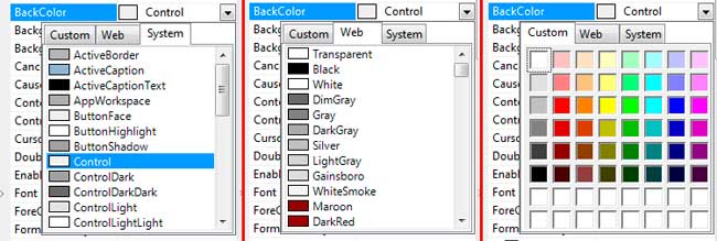
The System colors the colors your operating system uses as default colors for controls. The Web tab shows colors that are safe to use for the web. And the Custom tab shows much more colors. Alternatively, you can type the RGB values of the color separated by commas in the text box next to the property.
Adding a Background Image
We can change the background image of a control by using the BackgroundImage property. As an example, let’s change the background image of a form. Go to Properties Window while the form is selected and find the BackgroundImage property.
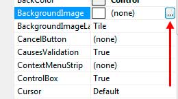
You will be presented with a window which allows you to choose a resource. For now, choose local resource and browse for an image by clicking the Import button.
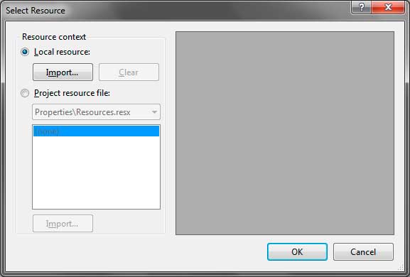
Once you choose an image, click OK. The background image will now show up on the form. The alignment and size of an image may not be what you desired. There is another property called the BackgroundImageLayout property. It accepts values from the System.Windows.Forms.ImageLayout enumeration.
| Value | Description |
|---|---|
| None | The image will be positioned using its top left corner with no resizing of the image. |
| Tile | If the image is smaller than the client area of the control, the image will be repeated until it fills the form. |
| Center | The image is centered within the control’s client area. |
| Stretch | The image will be resized to fit the client area of the control. |
| Zoom | The image will be fitted to the client area of the control without losing its aspect ratio. |
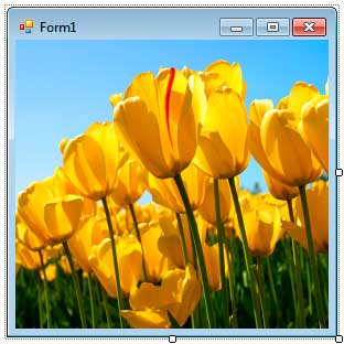
Most of the time, Stretch will work fine. The form below has a background image with an image layout of Stretch.
The Text Property
The Text property defines the text or caption inside the c# control. The text that the Text property represents varies on different controls. For example, Text property of the form gets or sets the caption located in its caption bar. The Text property of the button represents the Text inside the button. The Text property of a textbox represents the text inside the text box. We can use the TextAlign property to align the text in different locations of the control. If you click the TextAlign properties’ drop down box in the Properties Window, you will be presented with a small window that allows you to easily point which location you want the text to be aligned.

Changing the Font of the c# control
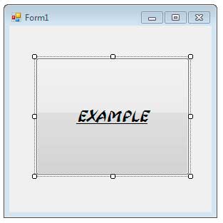
We can change the font type, color, size, and style of the control by using the Font and ForeColor properties. Let’s use a button control as an example.
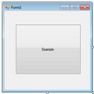
To change different font properties of the c# control, find the Font property in the Properties Window. You will notice a drop-down button in its left. Open it up and more properties about the font will be exposed.
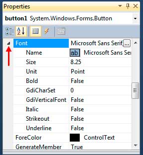
The useful one is the Name, which defines the type of font to use, the Size which indicates the size of font, Unit which tells the unit to use for the size of the font, and Italic, Strikeout, Underline and Bold to add styles to the control. Alternatively, you can use the button to the right of the font property to open the Font Window.
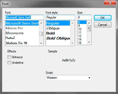
Here, you can choose the font type, the font style, the size and add certain effects. You can even see a preview of the font. With these, you can customize the font of the controls.
Enabling and Disabling Controls
We can use the Enabled property to tell whether c# control can receive focus and user interaction. We set the property to false to disable the control and true to enable it. When we disable the control, its appearance may change. For example, when we disable a button (setting its Enabled property to false), its color and appearance will change. Note that the change is only visible when you run the form and not in the designer.
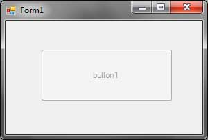
Making Controls Invisible
You can temporarily hide a control by setting the Visible property to false. The Visible property is a boolean property which tells whether the control is visible or not. Setting to false makes the control hidden, and setting it to true makes the control visible. Note that you will only see the effect when you run the form and not in the designer. This allows you to still select the control in the designer even if the Visible property is set to false.
More about the properties and features of controls will be discussed in the following lessons.
Control Events
The following table shows some useful events common to most controls.
| Event | Description |
|---|---|
| BackColorChanged | Occurs when the background color was changed. |
| BackgroundImageChanged | Occurs when the background image was added or changed. |
| Click | Occurs when you click the control with the left mouse button. |
| ControlAdded | Occurs when a child control is added to this control. |
| ControlRemoved | Occurs when a child control was removed from this control. |
| DoubleClick | Occurs when you double click the control. |
| DragDrop | Occurs when the drag-drop operation is completed. |
| EnabledChanged | Occurs when the control is enabled or disabled. |
| Enter | Occurs when the control is entered. |
| FontChanged | Occurs when the font properties are changed. |
| ForeColorChanged | Occurs when the fore color of the control is changed. |
| GotFocus | Occurs when the control got the focus. |
| KeyDown | Occurs when a key in the keyboard is pressed while the control has the focus. |
| KeyPress | Occurs when the key in the keyboard is pressed and released while the control has the focus. |
| KeyUp | Occurs when a pressed key in the keyboard is released while the control has the focus. |
| Leave | Occurs when the input focus leaves the control. |
| LostFocus | Occurs when the focus of the control is lost. |
| MouseClick | A more advanced version of the Click event. |
| MouseDoubleClick | A more advanced version of the DoubleClick event. |
| MouseDown | Occurs when a button in the mouse is down while inside the control. |
| MouseEnter | Occurs when the mouse pointer enters the control. |
| MouseHover | Occurs when the mouse pointer rests on the control |
| MouseLeave | Occurs when the mouse pointer leaves the control. |
| MouseMove | Occurs when the mouse pointer moves while inside the bounds of the control. |
| MouseUp | Occurs when a pressed button of the mouse is released while inside the control. |
| MouseWheel | Occurs when you move the mouse wheel while the control has the focus. |
| Move | Occurs when the control is moved. |
| Paint | Occurs when the control is redrawn. |
| ParentChanged | Occurs when the parent control of this control changes. |
| Resize | Occurs when the control is resized. |
| TextChanged | Occurs when the Text property of the control is modified. |
| Validated | Happens when the control is done approving. |
| Validating | Occurs when the control is validating. |
| VisibleChanged | Happens when the Visible property is changed. |
We will discuss most of the events above in later chapters.
c# control Methods
The following are the most useful methods of the Control class.
| Methods | Description |
|---|---|
| BringToFront | Brings control to the front of the z-order. |
| Contains | Tells whether a child control is contained inside this control. |
| CreateControl | Creates a new control and add it to this control. |
| FindForm | Retrieves the form that the control is on. |
| Focus | Sets the focus to this control. |
| GetContainerControl | Gains the power that fills in as the holder of this control. |
| Hide | Hides the control. |
| Refresh | Powers the control to negate its customer territory and instantly redraw itself and any kid controls. |
| Select | Activates the control |
| SendToBack | Brint the control to the back of the z-arrange. |
| Show | Shows a hidden control. |
| Update | Makes the control redraw the refuted areas inside its customer region. |
The Control class also offers some methods that allow you to manually trigger events of the control. Such methods start with On followed by the name of the event. For example, the OnClick event triggers the Click event when called. Note that some events cannot be triggered by user interaction such as the Paint event. If you want to trigger such events, use the methods offered by the c# control class. You will learn more about these methods when we delve deeper into the world of C#.
Note that these properties, events, and methods are inherited by most of the controls thanks to inheritance. Therefore, I may not include them again when I present the properties, events, and methods of individual controls unless they are very significant to the control.