TabControl
The TabControl control (System.Windows.Forms.TabControl) allows you to create tabbed windows that you can see in many applications. An example of a tabbed window is the properties window of files and the tabs in Visual Studio.
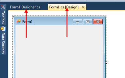
Figure 1 – Tabs in Visual Studio
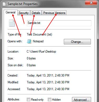
Figure 2 – Tabs in a Properties Window of a file
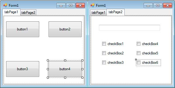
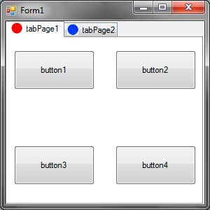
The TabControl serves as a container to other controls. You can access a tab by clicking it. The appearance of an active tab will change so you can distinguish which tab is activated. Once you click a tab, the controls that belong to it will be shown. The TabControl allows you to properly organize the a form into different tabs where each tab represents a category. For example, you can place a form that gets personal information on the Personal Info tab and the educational background in the Educational Background tab.
To add a tab control, go to the Containers category of the toolbox and find the TabControl. Drag it to the form. You can resize the control, but perhaps the best way is to use the Dock property so it will always take up the whole space of the form. You can go to the Properties window and find the Dock property. Click the drop down then click the middle button which means that the TabControl will be docked to all side of the form.
The TabControl consists of TabPage controls which represent the actual tab and its content. The tab pages of a tab control can be accessed using its TabPages property. The following are some useful methods of the TabPage control.
| Property | Description |
|---|---|
| Controls | The controls that exist inside this TabPage. |
| ImageIndex | Geting or seting the record showed up on this tab. |
| ImageKey | Geting or seting the key accessor for the photograph in the ImageList of the associated TabControl. |
| Text | The text that shows in the tab button of the TabPage. |
Figure 3 – TabPage Properties
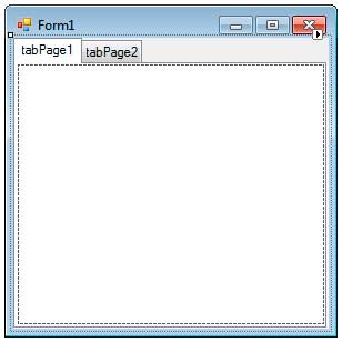
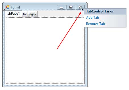
To add a tab page, you can click the small arrow button located at the upper right side of the TabControl. This will open the smart menu where you can add or remove tab pages.
Alternatively, you can go to properties window and find the TabPages property of the TabControl. Make sure that the TabControl is the control selected and not a TabPage. Click the button of the TabPages property to open the TabPages Collection Editor.
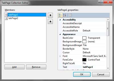
The TabPage Collection Editor allows you to add and remove tabs and change properties such as the text of individual tabs. You can add controls to individual containers of the tab. For example, drag some controls to the body of the first tab. Then you can click on the second tab in the Designer and you can add another set of controls for that tab.
Let us now discuss the TabControl itself. The following are some properties of the TabControl.
| Property | Description |
|---|---|
| Alignment | The area (top, bottom, left, right) where the tabs are aligned. The default is top. |
| Appearance | The appearance of the control’s tabs. |
| ImageList | Contains a list of images that will be displayed for each tab. |
| ItemSize | Specifies the size of the tab. |
| Multiline | Allows you to create multiple rows of tabs. |
| SelectedIndex | Specifies the index of the selected tab page. |
| SelectedTab | Gets or sets the selected tab. |
| TabCount | Returns the number of TabPages of the TabControl. |
| TabPages | Allows you to access the tab pages of the TabControl and add or remove tab pages. |
Figure 4 – TabControl properties
The Alignment property specifies where the tabs are located. The default value is Top which displays the tab in the top of the TabControl. The Appearance property changes the appearance of the tabs. It can accept three values such as Normal (the default), Buttons (which makes the tab look like a button), or FlatButtons (buttons that are not popping out). Figure 4 shows the appearance of the tab using different values for the Appearance property.
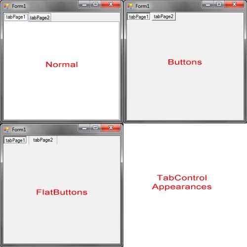
Figure 4 – TabControl Appearances
The ImageList Property allows you to add image icons to each tab. This property accepts a reference to an ImageList control. The ImageList control is commonly used for this property which is also available in other controls such as menus and tree views. We will discuss briefly here how to use the ImageList to provide images to other control, in this case, the TabControl. Drag an ImageList from the toolbox to the form. It is located in the Components section of the Toolbox. The ImageList will then be located in the component tray of the Designer. The ImageList will use the following two images:
Save it to any location in your hard drive. Now click the ImageList control located in the component tray of the Designer. Find the Images property in the Properties Window and click the button beside it. You will be presented with the Image Collection Editor.
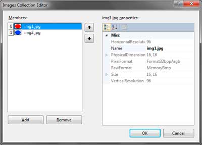
Clicking the Add button allows you to browse for an image. Add the two images I have provided then click OK. You must now assign the image list to the ImageList property of the TabControl. Go to the ImageList property of the TabControl and choose the image list we have created. To show this icon beside the tabs of the TabControl, select the individual tab page in the designer (by clicking its body) then go to the Properties Window and find the ImageIndex property. Clicking the dropdown beside it will show you the indexes and a preview of each image. Assign your desired index to each tab. You can use the same index for different tabs. Your tabs will now show images beside their text.
You can adjust the ItemSize property to adjust the size of tabs. This is useful when the images you placed in tabs are too big.
If the number of tabs is too many and it doesn’t fit the width of the form, then arrow buttons will show up to the top right of the TabControl next to the last visible tab.
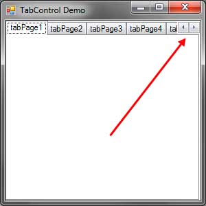
You can click the arrows to scroll the tabs to the left or to the right.
The MultiLine property allows you to create multiple columns of tabs. If the tabs are too many, then you can set this property to true.

The TabPages property allows you to add or remove tab pages to the TabControl. The following code programmatically adds three more tab pages to the TabControl.
TabPage tab1 = new TabPage("Tab 1");
TabPage tab2 = new TabPage("Tab 2");
TabPage tab3 = new TabPage("Tab 3");
tabControl1.TabPages.Add(tab1);
tabControl1.TabPages.Add(tab2);
tabControl1.TabPages.Add(tab3);
The TabPages has a type of TabPageCollection which is a collection of TabPage objects. Therefore, we can use typicall collection methods such as Add, Remove, or AddRange.
You can use the SelectedIndex property to get the index of the selected tab. The index is the position of the selected tab in the TabPages collection.
MessageBox.Show("The selected tab is " + tabControl1.TabPages[tabControl1.SelectedIndex].Text);The SelectedTab simply returns or sets the selected TabPage object.
TabPage selectedTab = tabControl1.SelectedTab;
MessageBox.Show("The selected tab is " + selectedTab.Text);
The TabCount simply returns the number of TabPages of the TabControl.
The TabControl has a SelectedIndexChanged event which triggers when the selected tab changes.
The TabControl is very useful when your form has different sections or categories. A good example where a TabControl will be useful is in a Form that provides the options or settings of an application.