ToolTip Control
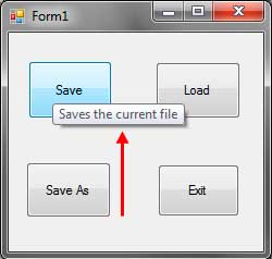
You can use the Tool Tip control (System.Windows.Forms.ToolTip) to display tool tips which offer description about the a certain control of part of the GUI. Tool tips can be seen in numerous applications including Visual Studio. Tool tips give you a brief description to the functionality of a certain GUI component or control.
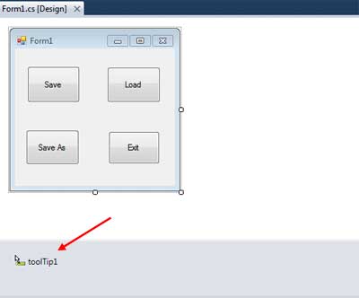
You can find the Tool Tip control in the common controls category. When you drag a Tool Tip control from the toolbox to the form, you will find it in the component tray section of the Designer.
Once a tool tip is placed, you need to assign it to a control. Whenever a tool ip is added to the form, a new property named Tool Tip is added to every control in the form. You can find it in the properties window.
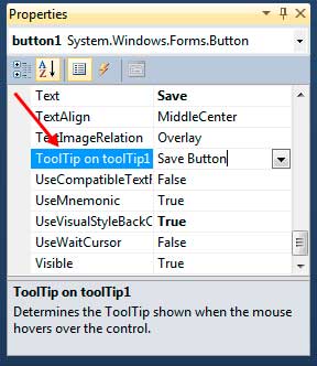
This new property specifies the text inside the tooltip that will be shown. Each tool tip you add will also add its own property to every control. So if, for example, we have two Tool Tips control added to the form, then two ToolTip properties will be added to each control.
Let’s take a look at some properties of the ToolTip control.
| Property | Description |
|---|---|
| Active | This property activates or deactivates the Tool Tip. |
| AutomaticDelay | This influences the estimation of other postpone properties. |
| AutoPopDelay | Decides the time the tool tip will remain noticeable. |
| InitialDelay | Decides an opportunity to hold up before the tool tip will fly out. |
| IsBalloon | Determines whether the tooltip should utilize a ballon-styled window. |
| ReshowDelay | Indicates the amount of your time that has to come back to pass before subsequent Tool Tip windows show up because the pointer moves beginning with one management then onto successive. |
| ShowAlways | Specifies whether a Tool Tip window is displayed, even when its parent control is not active. |
| ToolTipIcon | An optional action is shown to the left of the tool tip window. |
| ToolTipTitle | Adding a title to the tooltip messagbox. |
| UseFading | Indicates whether a blur impact ought to be utilized while showing the ToolTip. |
Figure 1 – ToolTip Properties
Before a tooltip can be shown, you need to activate it by setting the Active property to true. The AutoPopDelay determines how long the tooltip will stay visible when the mouse is over a control. The InitialDelay property specifies the time the mouse should stay over a control before the tooltip will show. The ReshowDelay specifies the time to wait before the Tooltip will be shown again when you move from one control to another control. The AutomaticDelay property automatically balances the three previously said properties. When set, the AutoPopDelay will be equivalent to ten times the value of AutomaticDelay. The values of InitialDelay will be equal to the AutomaticDelay and ReshowDelay will have a value which is half the value of AutomaticDelay. Note that these properties accept integers which represent milliseconds.
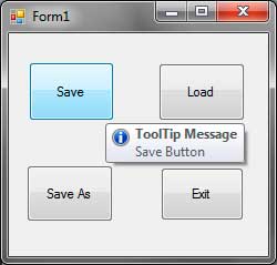
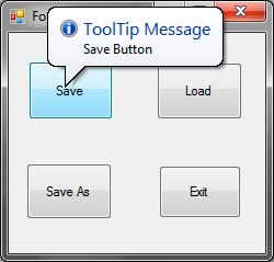
You can also add a title and an icon in a tooltip window using the ToolTipTitle and the ToolTipIcon properties.
You can also change the appearance of the tooltip window by setting the IsBalloon property to true.
You can add multiple ToolTip controls to the form so each control can use a different ToolTip with a different set of properties. Although a single control can use multiple tooltips at the same, time, it is not practical and looks weird when the tooltips pop out.