DateTimePicker Control
The DateTimePicker control (System.Windows.Forms.DateTimePicker) is used to pick a single date. The control appears by default, as a combo box with a calendar icon at the right part. You can select each date component and such as the month and use the arrow keys to adjust individual components.

The DateTimePicker control shows (by default) the current date or the selected date. By clicking the calendar icon during runtime, you will be presented with a calendar where you can choose dates.

You can then use this calendar to choose a specific date. You use the left and right navigation arrows to move to the previous or next month.

The initial view of the calendar shows all the days plus some trailing dates of the past and next months. Clicking the Title that displays the month and year changes the view and shows all the available month of the current year.

Clicking the year will show all the years in the current decade and clicking it even more allows you to easily choose dates way back in the past.
There are several properties that allow you to customize the appearance and behavior of the DateTimePicker control.
| Property | Description |
|---|---|
| CalendarFont | Gets or sets the font style applied to the calendar. |
| CalendarForeColor | Gets or sets the foreground color of the calendar. |
| CalendarMonthBackground | Gets or sets the background of the calendar month. |
| CalendarTitleBackColor | Gets or sets the background color of the calendar title. |
| CalendarTitleForeColor | Gets or sets the foreground color of the calendar title. |
| CalendarTrailingForeColor | Gets or sets the foreground color of the calendar trailing dates. |
| Checked | The ShowCheckBox property should be set to false to work with this property. When this value is true, the date is changed/updated. When this is false, the selected date cannot be changed. |
| CustomFormat | Accepts a custom format string the will format the date displayed. |
| Format | Determines the format of the date displayed by the control. |
| MaxDate | Gets or sets the greatest date and time that can be chosen in the control. |
| MinDate | Gets or sets the minimum date and time that can be selected in the control. |
| ShowCheckBox | If true shows a text box to the left part of the DateTimePicker control. When checked, the selected date can be changed. When unchecked, the selected date cannot be changed. |
| ShowUpDown | When set to true, shows an up-down button in place of the drop down button. You can’t access the calendar when this is shown. Instead, you need to select a date component and use the up-down arrows to adjust the date. |
| Value | The currently selected date. |
Figure 2 – DateTimePicker Properties
If you are using Windows Vista or Windows 7 and using themes such as Aero, then the properties that modify the color of the calendar has no effect. To see the results of fixing the colours of the calendar, we’d like to disable Visual designs. For the sake of demonstration, we’ll do exactly that. Find Program.cs in the solution explorer and open it by double clicking it. Comment out or delete the line:
Application.EnableVisualStyles();Just note that when you do this, the controls will use the old style classic look. You can now change the colors of the calendar using the different properties that modify the color.

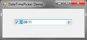
You can change the format of the date displayed using the Format property. You can use the Long, Short, Time, or Custom formats. When the Custom format is selected, you can specify a format string in the control’s CustomFormat property. For example, setting the format to MM-dd-yy shows the date using the month number, the date, and the last two digits of the year where each date component is separated with dashes. Example output would be 04-08-11. For a list of format specifiers for date and time, go here.
The ShowCheckBox property indicates whether to show a checkbox at the left side of the control.

When the check box is checked, you can select the date or time components and modify them using the arrow keys. If the check box is unchecked, then you are not allowed to do that. Clicking the dropdown button that shows the calendar checks the checkbox. The state of the checkbox can be accessed using the Checked property.
The ShowUpDown property transforms the dropdown button into an up-down button and hides the calendar icon as shown by the following screenshot.
This will prohibit you from accessing the calendar and limits you to using the up-down button. You select a date or time component and use the up-down button to adjust their values.
We can use the Value property to get or set the selected date of the DateTimePicker control. We can also handle the ValueChangedevent of the control to react to changes in date.