ListView Control
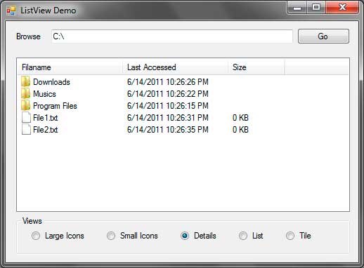
The ListView control (System.Windows.Forms.ListView) allows you to show a list of items in different views and add icons to each of them. The ListView control is composed of ListViewItems which form a grid-like structure of row and columns. Each ListViewItemhas a label and the every ListViewItem in the first column can have an icon beside them. One common use of the ListView control is to show a list of files and folders to the user. Figure 1 shows how a ListView will look like.

Figure 1 – ListView Example
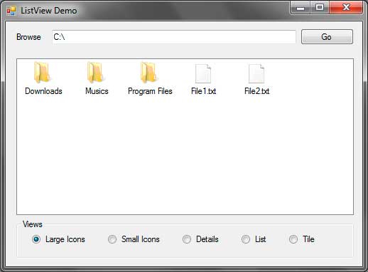
You can see that the Windows Explorer uses a ListView to show files and folders. The one shown above uses the Details View, although there are more types of Views available such as Large Icons and Small Icons. The following tables shows some useful properties, methods, and events offered by the ListView control.
| Property | Description |
|---|---|
| Activation | Specifies how the user can activate an item in the ListView. Posible values are: OneClick: Activates an item using a single click. TwoClick: Activates an item using double click. Standard: Use the computer’s settings. |
| Alignment | Specifies the alignment of the items in the ListView. Possible values are: Default: Uses no alignment for the items. Left: Aligns the items to the left of the ListView. Top: Aligns the items to the top of the ListView. SnapToGrid: Creates an invisible grid where the items will snap to it. |
| AllowColumnReorder | Specifies whether the user can reorder the columns by dragging their column headers to the left or to the right. |
| AutoArrange | When set to true, items will automatically be arranged depending on the Alignment property. The effect can only be seen when using the LargeIcon or SmallIcon Views. |
| CheckBoxes | Specifies whether to show a checkbox to the left of each item when using the Details View. |
| CheckedIndices | Specifies a collection of indices of checked items. |
| CheckedItems | Specifies a collection of checked items. |
| Columns | Contains a collection of columns for the ListView and allows you to add or remove a column. |
| FocusedItem | Contains the item that is selected in the ListView. Returns null if nothing is selected. |
| FullRowSelect | Specifies whether to select the whole row when an item is clicked. |
| GridLines | Specifies whether to draw grid lines when the ListView is using the Details View. |
| HeaderStyle | Specifies the style of each column header. Possible values are: Clickable: Allows you to click the header just like a button. NonClickable: The header won’t respond to mouse clicks. None: The headers will be hidden. |
| HoverSelection | Specifies whether to select an item just by hovering your mouse pointer over it. |
| Items | Contains a collection of Items in the ListView. |
| LabelEdit | Specifies whether the user is able to edit the text of an item. |
| LabelWrap | Specifies whether the labels should wrap over multiple lines to occupy the text. |
| LargeImageList | Specifies the ImageList control that contains the icons to use when using the LargeIcon View. |
| MultiSelect | Specifies whether the user can select multiple items. |
| Scrollable | Specifies whether to show scrollbars. |
| SelectedIndices | Contians a collection of indices of selected items. |
| SelectedItems | Contains a collection of selected items. |
| ShowItemToolTips | Specifies whether to show tool tips for each item that has a ToolTip associated to it. |
| SmallImageList | Specifies the ImageList control that contains the icons to use when using the SmallIcon View. |
| Sorting | Allows the ListView to sort the items using one of these possible values: Ascending: Sorts the items in ascending order. Descending: Sorts the items in descending order. None: Do not sort the items. |
| StateImageList | Specifies the ImageList to use that determines the state of each item. When checkboxes are shown at the left or each item, the two images contained in the ImageList of this property replaces the unchecked and checked appearance of those checkboxes. |
| TopItem | Contains the item at the top of the ListView. |
| View | Specifies how the items are shown. Possible values are: LargeIcon: Items are displayed using 32×32 icons and a label. SmallIcon: Items are displayed using 16×16 icons and a label. List: Displays the items as a list with icons and labels. Details: Displays multiple columns that can contain information about the each item. Tile: Displays large icon and a label with sub-information for each of the items. |
Figure 2 – ListView Properties
| Method | Description |
|---|---|
| BeginUpdate | Tells the ListView to temporary stop drawing visual updates until EndUpdate() is called which prevents the control from flickering. |
| Clear | Removes all items in the ListView. |
| EndUpdate | Signals the ListView to draw all the updates. You can call this method after calling the BeginUpdate() method. |
| EnsureVisible | Automatically scrolls the ListView so the item with the index you specified is shown. |
| GetItemsAt | Gets the ListViewItem specified in position x, y (row, column). |
Figure 3 – ListView Methods
| Event | Description |
|---|---|
| AfterLabelEdit | Triggers after the editing of a label. |
| BeforeLabelEdit | Triggers before the user begins editing a label. |
| ColumnClick | Triggers when the user clicks a column. |
| ItemActivate | Triggers when the user activates or selects an item. |
Figure 4 – ListView Events
Now that you are familiar with the properties, methods, and events of the ListView control, let’s create a sample application that will demonstrate the capability of the ListView control. We will create a simple file browser that displays the contents of a specified directory. Each subdirectory will be represented by folders and files will be represented with a blank paper. You need to download the following .ico files that we will use in this exercise.
Extract the contents of the WinRAR file to a location that you can easily find. Create a new windows forms application and name it ListViewDemo. The following shows the GUI for the application that we will create.

| Label | Type | Name | Properties | |
|---|---|---|---|---|
| 1 | ListView | listViewFolderFiles | View | Details |
| SmallImageList | imageListSmallIcons | |||
| LargeImageList | imageListLargeIcons | |||
| 2 | TextBox | textBoxPath | Text | C: |
| 3 | Button | buttonGo | Text | Go |
| 4 | RadioButton | radioButtonLargeIcons | Text | Large Icons |
| 5 | RadioButton | radioButtonSmallIcons | Text | Small Icons |
| 6 | RadioButton | radioButtonDetails | Text | Details |
| Enabled | True | |||
| 7 | RadioButton | radioButtonList | Text | List |
| 8 | RadioButton | radioButtonTile | Text | Tile |
Figure 5
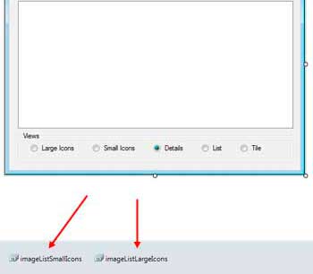
After constructing the GUI, we need to create two ImageList controls. An ImageList control is used to contain a collection of images to be used by other controls such as ListView or a menu. The images contained by the ImageList control should be of the same size. The ImageList control is located in the Components section of the ToolBox so drag two of them to the form. Notice that the controls are added to the component tray since they have no visual representation. Name the controls imageListSmallIcons and imageListLargeIcons.
The imageListSmallIcons will contain small icons and the imageListLargeIcons contains icons that will be shown when the ListView is required to show the items with large icons. Let’s first add the images for the imageListLargeIcons. You will find a small square button with an arrow at the upper right of the control. Click it and change the image size to 32, 32 which means that we will be adding 32×32 pixel images.
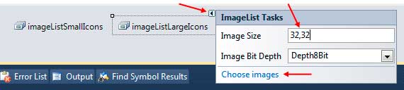
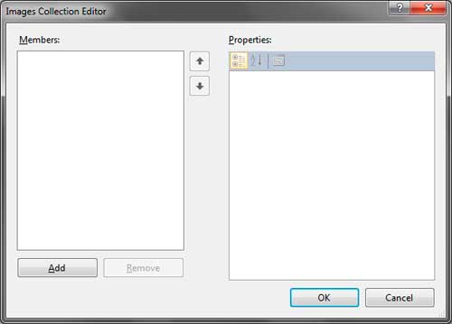
Click Choose images to open the Image Collection Editor.
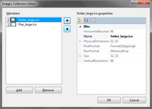
Click the Add button and browse for the folder where you placed the extracted images from the file you downloaded earlier. Select the folder_large.ico and files_large.ico files and click Open. The files will now show up in the Images Collection Editor. The up and down arrows in the middle allows you to change the index of each image which we will use later. Be sure that folder_large.ico is in the index 0.
Click OK to add the images to the imageListLargeIcons. Do the same for the imageListSmallIcons. Leave the size to 16,16 and browse for the folder_small.ico and files_small.ico files. Also ensure that the folder_small.ico is at index 0.
The final step for preparing our GUI is to assign the ImageLists we created to the LargeImageList and SmallImageList properties of the ListView. In the properties window, find the LargeImageList property and click the drop down button then choose imageListLargeIcons. Do the same for the SmallImageList and use the imageListSmallIcons for it. We are now ready to add codes to our application.
Go to the code editor by pressing F7 while in the Designer. Import the System.IO namespace as we will use it later. Write the following method that will create the necessary columns for the ListView control.
private void CreateColumns()
{
    ColumnHeader filenameHeader = new ColumnHeader();
    filenameHeader.Text = "Filaname";
    filenameHeader.Width = 150;
    listViewFolderFiles.Columns.Add(filenameHeader);

    ColumnHeader lastAccessTimeHeader = new ColumnHeader("Last Accessed");
    lastAccessTimeHeader.Text = "Last Accessed";
    lastAccessTimeHeader.Width = 150;
    listViewFolderFiles.Columns.Add(lastAccessTimeHeader);

    ColumnHeader sizeHeader = new ColumnHeader("Size");
    sizeHeader.Text = "Size";
    sizeHeader.Width = 80;
    listViewFolderFiles.Columns.Add(sizeHeader);
}
Example 1 – CreateColumns() Method
We created 3 ColumnHeaders for the ListView control. The first column will show the File and Directory names. The second shows the last access time of the file or directory, and the last one shows the size of every file. We also set the sizes of each column to appropriate size to occupy the text of the headers. We then use the Add() method of the Columns property of the ListView to add the headers to the control.
Write the following method which will handle the showing of the files and directories to the ListView.
private void ShowItemsOfDirectory(string directory)
{
    DirectoryInfo currentDirectory = new DirectoryInfo(directory);
    DirectoryInfo[] subdirectories = currentDirectory.GetDirectories();
    FileInfo[] files = currentDirectory.GetFiles();

    listViewFolderFiles.Items.Clear();
    listViewFolderFiles.BeginUpdate();

    foreach (DirectoryInfo dir in subdirectories)
    {
        ListViewItem item = new ListViewItem();
        item.Text = dir.Name;
        item.ImageIndex = 0;

        ListViewItem.ListViewSubItem subitem = new ListViewItem.ListViewSubItem();
        subitem.Text = dir.LastAccessTime.ToString();
        item.SubItems.Add(subitem);

        subitem = new ListViewItem.ListViewSubItem();
        subitem.Text = String.Empty;
        item.SubItems.Add(subitem);

        listViewFolderFiles.Items.Add(item);
    }

    foreach (FileInfo file in files)
    {
        ListViewItem item = new ListViewItem();
        item.Text = file.Name;
        item.ImageIndex = 1;

        ListViewItem.ListViewSubItem subitem = new ListViewItem.ListViewSubItem();
        subitem.Text = file.LastAccessTime.ToString();
        item.SubItems.Add(subitem);

        subitem = new ListViewItem.ListViewSubItem();
        subitem.Text = (file.Length / 1000) + " KB";
        item.SubItems.Add(subitem);

        listViewFolderFiles.Items.Add(item);
    }

    listViewFolderFiles.EndUpdate();
}
Example 2 – ShowItemsOfDirectory() Method
The method has one parameter which is the path of the directory whose contents will be shown to the ListView. Line 3 creates a DirectoryInfo object based on the directory path passed to the method. We then extracted the subdirectories and files (lines 4-5) using the DirectoryInfo.GetDirectories() and DirectoryInfo.GetFiles() mehtods. Line 7 removes any existing items in the ListViewusing the Clear() method. In line 8, we used the BeginUpdate() method because we will begin the adding of rows to the ListViewcontrol.
Lines 10-25 uses a foreach loop to add every subdirectory of the given directory. Line 12 creates a ListViewItem which represents an item or row in the ListView. We used the Text property and assign the Name of the directory to show the name of the directory as the label for the item. Line 14 specifies the index of the image to use in the assigned ImageLists controls. We used the ImageIndexproperty of the ListViewItem and assigned zero because we placed the folder icon for both ImageLists at index 0. We then add the FullName which represents the full path of the directory to the Tag property because we will use it later in another method.
Every subsequent column is the ListViewItem‘s subitems. Since we have 3 columns, the last 2 columns are subitems of the first column. Line 16 creates a ListViewSubItem object. Note that ListViewSubItem is an inner class of the ListViewItem so you need to address this class as ListViewItem.ListViewSubItem. Line 17 assigns the LastAccessTime of the directory to the label of the second column. Line 18 adds the subitem to the SubItems property of the ListViewItem. A new instance of ListViewSubItem was created in line 20 for the third column. We won’t be showing the size of every subdirectory so we assigned String.Empty to the Text property of the third column. We also add it to the SubItems proeprty of the ListViewItem. Line 24 finally adds the full constructed ListViewItem to the Items property of the ListView.
Line 27-42 creates another foreach loop to enumerate the files in the given directory. The code is pretty much simillar to the first forloop except that we will now use 1 for the ImageIndex. Line 38 also assigns the size of the file to the label of the third column. Note that the size was converted to KB for a more practical look. After all the files has been added to the ListView, we called to EndUpdate() method to show the changes and the added rows to the ListView.
Modify the Form1() constructor to feature some line of code to feature codes that decision the CreateColumns() and ShowItemsOfDirectory()methods.
public Form1()
{
    InitializeComponent();

    CreateColumns();
    ShowItemsOfDirectory(textBoxPath.Text);
}
Line 6 calls the CreateColumns() method we created to create the three columns for our ListView. Line seven calls the ShowItemsOfDirectory() method and that we passed the text of textBoxPath which is initially C:.Therefore, when you run the program, the contents of C: are initially shown.
Go back to Designer and double click buttonGo and use the following event handler for its Click event.
private void buttonGo_Click(object sender, EventArgs e)
{
    ShowItemsOfDirectory(textBoxPath.Text);
}
When the user types a directory path in the text box, pressing buttonGo will show the contents of that directory.
Finally, we now need to add event handlers for the radio buttons that changes the view of the ListView control. Double click each of the radio buttons and simply assign the right View to the View property of the ListView.
private void radioButtonLargeIcons_CheckedChanged(object sender, EventArgs e)
{
    listViewFolderFiles.View = View.LargeIcon;
}

private void radioButtonSmallIcons_CheckedChanged(object sender, EventArgs e)
{
    listViewFolderFiles.View = View.SmallIcon;
}

private void radioButtonDetails_CheckedChanged(object sender, EventArgs e)
{
    listViewFolderFiles.View = View.Details;
}

private void radioButtonList_CheckedChanged(object sender, EventArgs e)
{
    listViewFolderFiles.View = View.List;
}

private void radioButtonTile_CheckedChanged(object sender, EventArgs e)
{
    listViewFolderFiles.View = View.Tile;
}
Run the program and you will see that the contents of C: are initially shown. Type another directory and press Go to check its contents. Change the view of the ListView using the radio buttons to see how each View looks.