Panel and GroupBox Controls
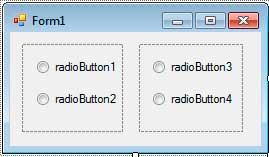
The Panel control is used to group controls on a form. One good use of a panel is when you want to group radio buttons. Only one radio button from a set of radio buttons is allowed to be on. By grouping radio buttons, you can have more than one radio button that is turned on. To try this out, drag two panels to the form. It can be found in the Containers tab of the toolbox. Adjust their sizes using the resizing handles. To add a control to a panel, simply put the controls inside it. Place two radio buttons inside each of the panels. Below is how your form should look like in the designer view.

Once you place a control inside a panel, the control becomes the child of the panel. The panel, therefore, becomes the parent of the control. To better illustrate that relationship, try moving the panel. All controls inside the panel move with it. The relationship also allows the parent and the child to share the values of common properties. For example, setting the Enable property of the panel to false not only disables the form, but every control inside of it as well.
You could notice that the panel in the designer view is represented by a dashed box (by default). This will not be visible when you run the actual program, but you will have an option to add visible borders for the panel. Below are some properties of the Panel control.
| Property | Description |
|---|---|
| BorderStyle | Sets the border style of the panel. |
| Controls | A collection of child controls inside the panel. |
| Enabled | Allows you to disable or enable a control. |
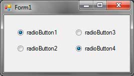
Now run the program. You can now turn two radio buttons from different groups.

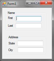
The GroupBox control is a similar control but allows you to add captions for each group. You do that by using the Text property of the GroupBox control. The GroupBox control also has a default border.
